Does This Look Similar?
I really want to sing the Sesame Street song that goes One Thing Is Not Like the Other but I would take out the word NOT.
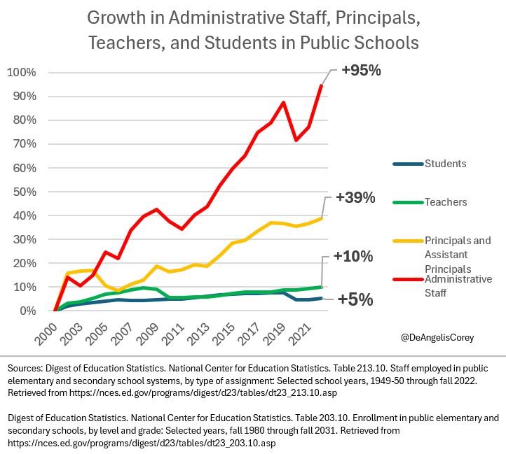
I am just going to let you digest this graph above for a bit.
Now look at this:
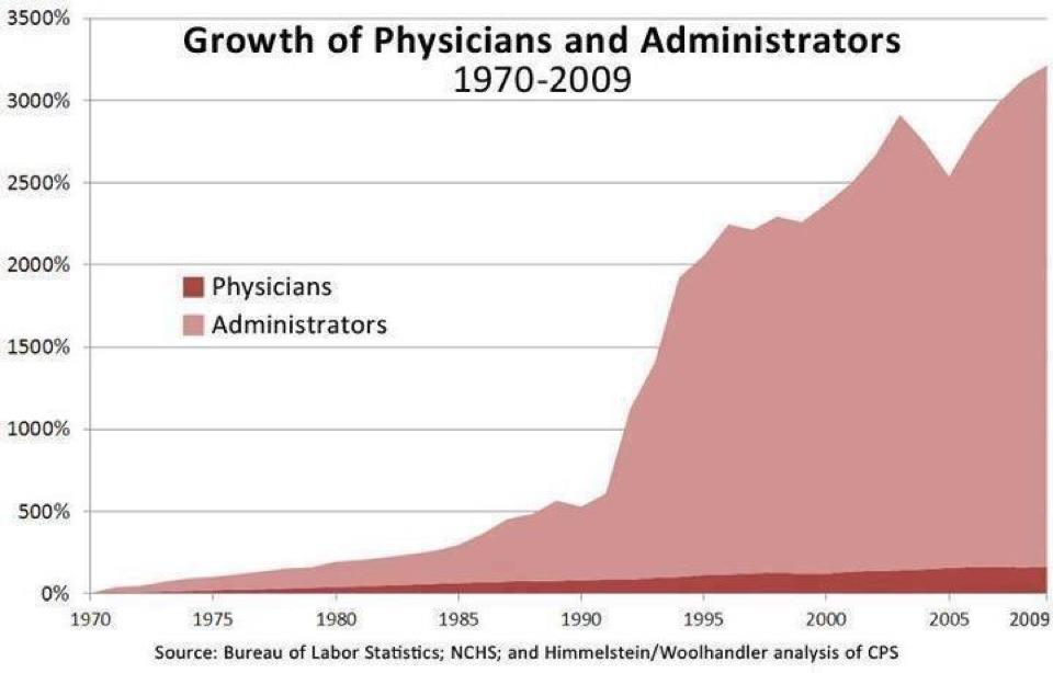
This graph shows why Direct Primary Care is continuing to grow. I have heard criticism of this image that it may not be accurate. Duh. It stopped in 2009 before the ACA made things even worse with administrative bloat.
And you wonder why teachers and doctors are burning out? Both have unproven quality metrics and indicators. Both let bureaucracy take over.
And you wonder why both the educational and healthcare systems are broken?
Wonder no more.
The rate of burnout for both doctors and teachers is directly proportional to the amount of administrative drag impeding them from doing their jobs.
It will not get better for either group.
Home school may be the only way for teachers to be happy again. I don’t know because that is not my area of expertise.
What I do know is that Direct Primary Care and Direct Specialty Care is the ONLY way for the majority of physicians to be happy again.


Still do not like the term “burnout” as it connotates that it’s the employees’ (physician’s) fault. They cannot handle the workload. Abuse or mistreatment are better terms for this, as they accurately describes what is happening.